Get Moving (or not) with CSS Motion Path
With the release of Firefox 72 on January 7, 2020, CSS Motion Path is now in Firefox, new Edge (slated for a January 15, 2020 stable release), Chrome, and Opera (and other Blink-based browsers). That means each of these browsers supports a common baseline of offset-path: path(), offset-distance, and offset-rotate.
Firefox also released stable support for offset-anchor (currently behind the "Experimental Web Platform Features" flag in Blink-based browsers). To celebrate, let’s review the basics of what is supported, explain some of the specifics when a path is applied, and also highlight the possibilities of offset-anchor.
See the Pen Shape Revealer 2020 by Dan Wilson (@danwilson) on CodePen.
Defining a path
There technically is no motion involved when using any of the properties defined in the CSS Motion Path specification. The offset-path property allows you to set up an invisible path that an element can follow.
#my-element {
  offset-path: path('M0,0 C40,160 60,160 100,0');
}
If you are familiar with SVG paths, or have explored other places to use the path() function like newer clip-path options, this might seem familiar. This collection of letters, numbers, and commas is a way to specify vectorized lines, curves, and more. This previous example makes a U-shaped curve starting at 0px,0px and ending 100px to the right at 100px,0px. To learn more about this syntax, check out Joni Trythall’s SVG Pocket Guide or the Illustrated SVG path Syntax Guide on CSS-Tricks.
Some quick basics:
M 0,0means move to thex, ycoordinates of0, 0without drawing anythingL 10,10means draw a line from the previous point to10,10- Bezier Curves are handled with
Cand three sets of coordinates.
There are many other ways in the CSS Motion Path specification to set an offset path, such as using other CSS Shape functions like circle(), the element’s box, or the new ray() function that introduces polar coordinates to CSS. However, at this time, only path() is supported in all the browsers already mentioned. There is significant progress made with ray() behind flags, so it is likely to be the next to be released.
Defining a distance
The offset distance will be any length value, though I would wager that percentages are the most valuable as 100% always represents the end of the path. So going halfway along the path is as straightforward as saying 50%.
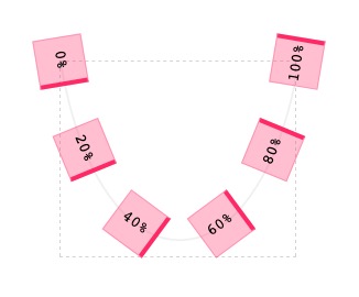
offset-distance on a path. View the live example on CodePen.Animating along the path
As stated earlier, the CSS Motion Path spec actually does not provide motion out of the box. We take our path definition and then use the existing tried and true animation methods to animate the value of offset-distance. So to animate an element along its entire path from 0% (the default value of offset-distance) to 100% we can set up a CSS animation (or use the Web Animations API, requestAnimationFrame, etc.) to modify these values.
#my-element {
  offset-path: path('M0,0 C40,160 60,160 100,0');
  animation: go 4000ms infinite ease-in-out;
}
@keyframes go {
  100% {
    offset-distance: 100%;
  }
}
See the Pen Offset-distance in motion by Dan Wilson (@danwilson) on CodePen.
Animating the path itself
We can also change the path itself, and if it has the same number of data points the brower can interpolate the values and smoothly transition the path. If we start with a simple straigh path defined as path('M0,0 L100,100') (which defines a line segment from 0px,0px to 100px,100px) we are able to animate it to a new line segment as long as it also has only two points, such as path('M100,0 L0,100'). If you try to go to path('M100,0 L0,100 L100,100') the browser will not be able to determine the in-between values since the paths have a different number of points, so the path will simply toggle between the two definitions instead of smoothly transitioning.
See the Pen Animating offset-path by Dan Wilson (@danwilson) on CodePen.
Defining where the element faces
By default, the element will "face" the direction of the path, with its right side staying perpendicular to the path at all times. This is thanks to the auto value of the third offset property offset-rotate. If we would rather the element face away from the direction of the path we can use the value reverse.
The offset-rotate property also takes angle values if you want to have the element stay in a fixed direction at a certain angle and not follow the path. With 0deg, the element will stay in its original, non-pathed orientation where the right side always continues to face the right regardless the direction of the path.
The last option is to combine the keywords auto or reverse with a second option of an angle. By setting, for example, offset-rotate: auto 90deg the element will rotate to account for the direction of the path, but it will have an added offset of 90 degrees. So by rotating the element a quarter turn, it is now the top side that faces the direction of the path and remains perpendicular to it.
See the Pen offset-rotate vs. transform/rotate by Dan Wilson (@danwilson) on CodePen.
Just as offset-path and offset-distance are animatable, when using angles (even in combination with auto/reverse) the offset-rotate property can be animated.
Defining the anchor point on the path
Elements will be centered on the path, but we can change this by setting the offset-anchor property. The types of values are similar to what you see in background-position or a two-dimensional transform-origin where you set the horizontal (x-axis) position and the vertical (y-axis) position. So the default value is offset-anchor: 50% 50% which can also be specified as center center. We can do the top left corner (same as 0% 0%) or any other length/percentage value to change the point on the element that anchors to the path. It is even possible to use values outside the bounds of the element with negative numbers or percentages beyond 100%, for example.
See the Pen Offset Path Anchor by Dan Wilson (@danwilson) on CodePen.
When the values are lengths or percentages, the anchor property can be animated. Therefore, each of the four offset properties can be animated even though the only one that moves along the path in the traditional sense is offset-distance.
See the Pen animating offset distance, rotate, and anchor by Dan Wilson (@danwilson) on CodePen.
Why does my element shift when I only apply a path?
You might suspect that nothing really happens when you specify a path alone, as it is the distance, rotation, and anchor that affect how an element appears along the path.
The path itself has its 0,0 coordinates placed at the element’s original placement in the document flow. When specifying only an offset-path, our element is placed at the start of our (invisible) path (offset-distance: 0%). It is very likely the element will visually look different, though, as it is the element’s center point that is placed at the start of the path (offset-anchor: 50% 50%), and its original right side will face the direction of the path (offset-rotate: auto).

offset-path defined due to the specified starting point and the default values for the other properties. View the live example on CodePen.If the start of the path is at the top left corner then at a minimum the element will be shifted up and to the left such that the anchor point (at center center by default) is at the top left corner of the element’s original position. If you would rather have the element stay in its initial position at the start, you likely will need to rework the path definition to start at your initial anchor point or work some magic with position or the independent transform properties.
Conclusion
Those are some key basics, but there are certainly many possibilities to explore. Motion paths are often associated with continuous curves, but there is nothing that says you cannot use straight lines or disconnected paths. Motion paths are typically associated with, well, motion, but offset can provide a unique way to simply position elements statically. The time to explore their possibilities is now.