Path to Palindromes: Puzzles and the Web

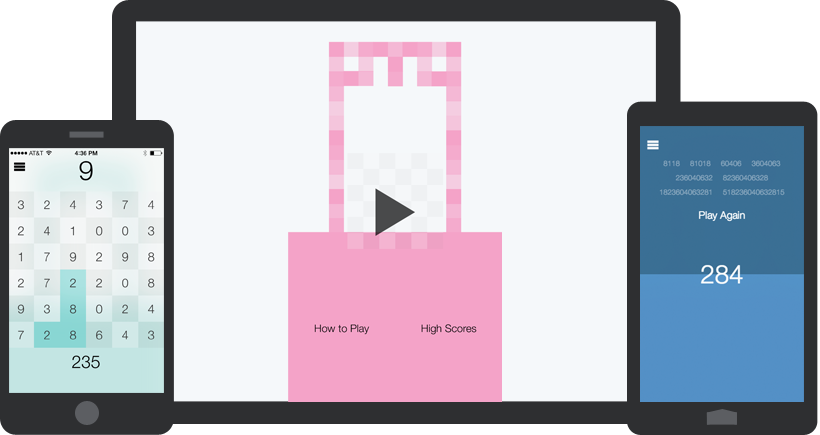
Path to Palindromes debuted this past week on iOS and Android... for free. This is my first attempt at developing a game, and it was admittedly a lot of fun. I used to tell people I don't have games on my phone, but really it's just that they are all in word/number puzzle form. Letterpress and SpellTower are two of my favorites, and both begin simply as a grid made up of letters.
The objective: Find as many palindromes as possible within a grid of numbers before time runs out. A little math/vocabulary refresher... a palindrome is a number (or word) that reads the same backward as forward, such as 989 or 358853 (or mom or racecar). Score by connecting any adjacent/diagonal numbers to form a palindrome. The longer the palindrome the more points you get. Simple... as far as rules go.
Technically Speaking
To create the game, I used some familiar (to me) tools: Cordova for packaging the app for the AppStore and Google Play, Lavaca for client side MVC, and Hammer.js for gesture abstractions (because dragging is so much simpler with it, especially since I am completing a version for Windows and Windows Phone which use the much-preferred-by-me pointer events spec instead of touch events).
Running the app on the iPhone or iPad will have some iOS7-esque things... namely transparencies, blurs, and layers. The app is one main screen with three actionable items that when tapped load a new screen on top of the main screen. Since I kept it simple with no left-to-right transitions, I was able to blur the main screen while the selected "sub screen" is maximized. This involves a transition on the scale and opacity of the selected screen while simultaneously transitioning the main background to a blurred version.
While you can animate CSS filters, I assumed (yeah... I'll do a test someday) that it's not great for performance (going from filter: blur(0) to filter: blur(40px) for example). Therefore I used a variation of a technique on the great CSS Tricks using two stacked backgrounds (my main background and the blurred version of it) with the help of opacity, transition, and ::after. Is it perfect? No. Do I feel it's close enough since it only happens for .35 seconds as a new section is coming in? Yes.
See the Pen Blur background by @danwilson on CodePen.
Time to Develop and the Main Hangup
I had the idea for this game in August, and took a vacation day to see if I could get it working in a day. I got very close: The basic mechanisms, style, and tapping the board to select tiles worked (and this was before iOS 7 designs came into play)... but I got caught up on being able to simply drag through the tiles to play. I wasn't using hammer for one, so I was tracking everything myself. But there were two bigger pieces that tripped me up: How to undo and how to make sure when you play diagonally with a finger that you don't accidentally select nearby tiles.
So I stepped away and revisited it in December by scrapping everything and starting over. This time I went in with Hammer so I didn't have to be creative. Ultimately I went with a solution that puts an invisible element inside each tile that is a circle, so the selection will not trigger until the finger is over that smaller circle.
The rules then became if you are in "dragging mode" and your finger is over the selectable circle, follow these rules:
- Is the current tile adjacent or diagonal to the last played tile? Then add it to the current palindrome
- If not, then is it the second-to-last tile in the palindrome? Then take away the last tile in the palindrome (Undo action)
- Otherwise the tile is not actionable
Once this got a clear answer the game only a couple days of development. I kept the game simple for a reason. Thanks to Cordova plugins that installed without issue (Lee Crossley's iOS GameCenter Plugin especially) and great support for the web on iOS7 and Android KitKat, I was able to submit both to the AppStore and Google Play after a couple more days testing.
The Web for Games
In my head, the web always seemed like it would be perfect for little puzzle games, and this experiment proved me right, thankfully. If you want to play online, I am also making the game available in the browser, since I talk about liking the web so much. Admittedly, I've not tested it much in older browsers, but I'm releasing it more as a testing exercise... which is why I waited so long to mention it.
Five years ago, I feel something like this wouldn't have made sense with front-end web technology. But with a solid Javascript architecture, CSS animations and transitions, and people thinking about how to support multiple inputs like mouse and touch, it's now possible to develop well-performing games in the browser.
If you have any feedback on the game, or if you want to share other examples of browser puzzle games, reach out to me on Twitter. I hope you like it.